BACKGROUND
OpsPanda (Acquired by Xactly) helps Sales Executives and Sales Operation Managers determine their sales capacity and see whether their targets are achievable. When corporate targets don’t line up with sales team’s capacity, it becomes a nightmare for sales executives to use spreadsheets to track and align corporate targets across territories, products, business segments, and sales reps (employee types) over multiple years.
OVERVIEW
- My Role - Lead UX designer
- Target Users - Sales Executives, Sales operation managers
- Product Category - CPM (corporate performance management) web application
- Accomplishment - Revamped overall site structure. Created work flows, wireframes, and completed brand new style guide. Created polished visual mockups and interactive prototypes for internal testings with stakeholders.
- Length of the Project - 2015 September to 2016 July

OpsPanda's goal was to build a data driven planning solution that allows sales executives to continuously build, monitor and adapt their sales plans.
PROCESS
Identified Problems Through an Audit of Beta Release
When I first started working on this product, OpsPanda was in stealth mode. Although there was a beta version that was designed by a development agency oversea, we couldn't interview externally with end users, so I interviewed few internal users and found out many usability issues.
Key Findings 1. The most critical issue was on the plan overview bar graph. It was a static image but most of the users thought they would be able to manipulate the graph with user interaction. 2. It was also difficult for users to distinguish Plan vs. Target and Target Quota vs. Plan Quota mainly due to the colors used on the graph. 3. Another issue was the overall navigation which was showing first navigation layer on the left and secondary layer on the top, it was confusing and not aligned with user's mental model. 4. Using accordion table to show sales territories became an issue for territories with more than 3 levels. It was hard to scroll and compare sales data of each territory on this table view.

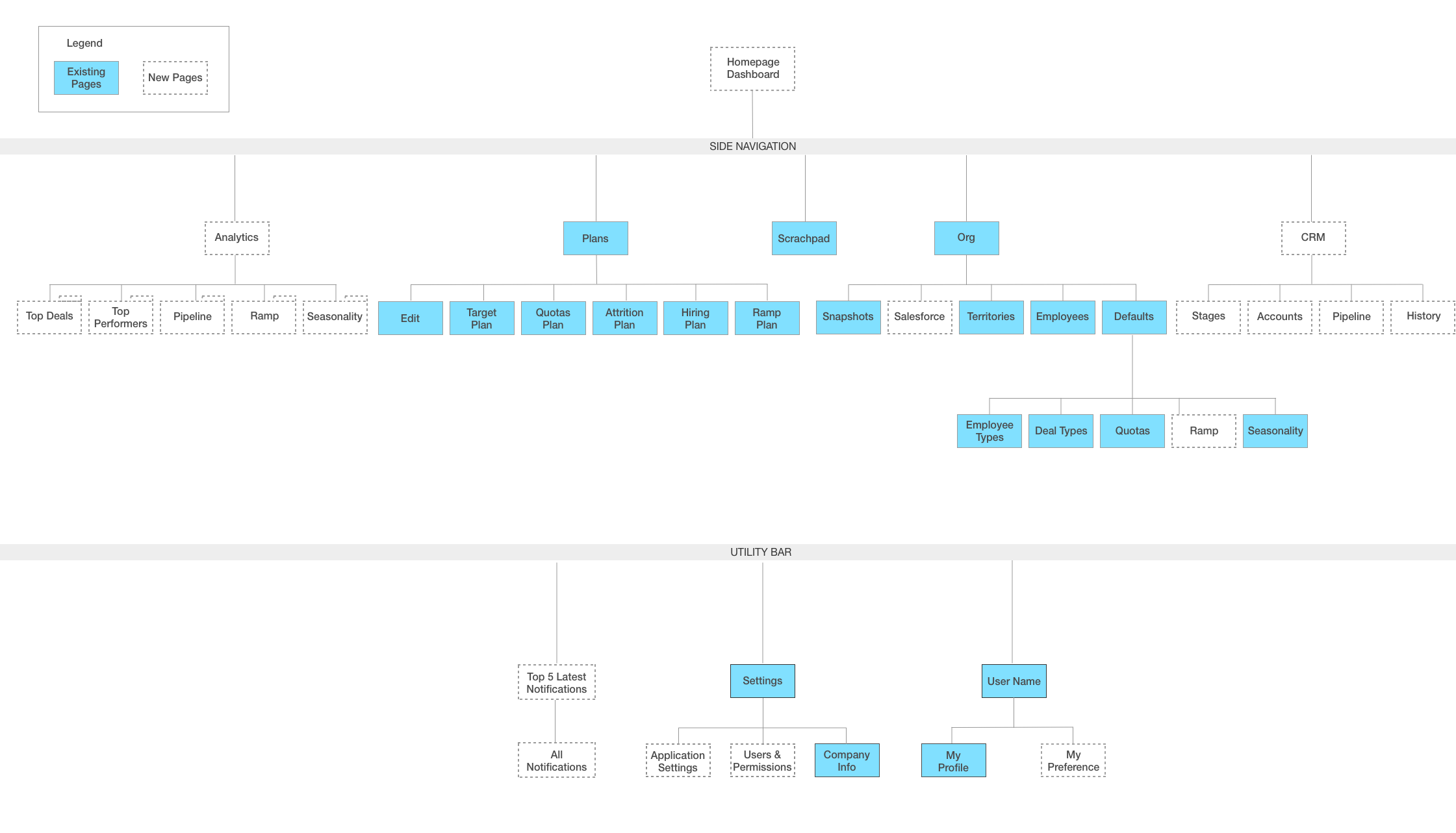
Information Architect
After the design audit and interviewing with internal users and stakeholders, I gained insight from sales executives and sales operation manager's daily tasks and pain points, I redesigned the information architect and identified future road map.
Resource Planning & Analysis
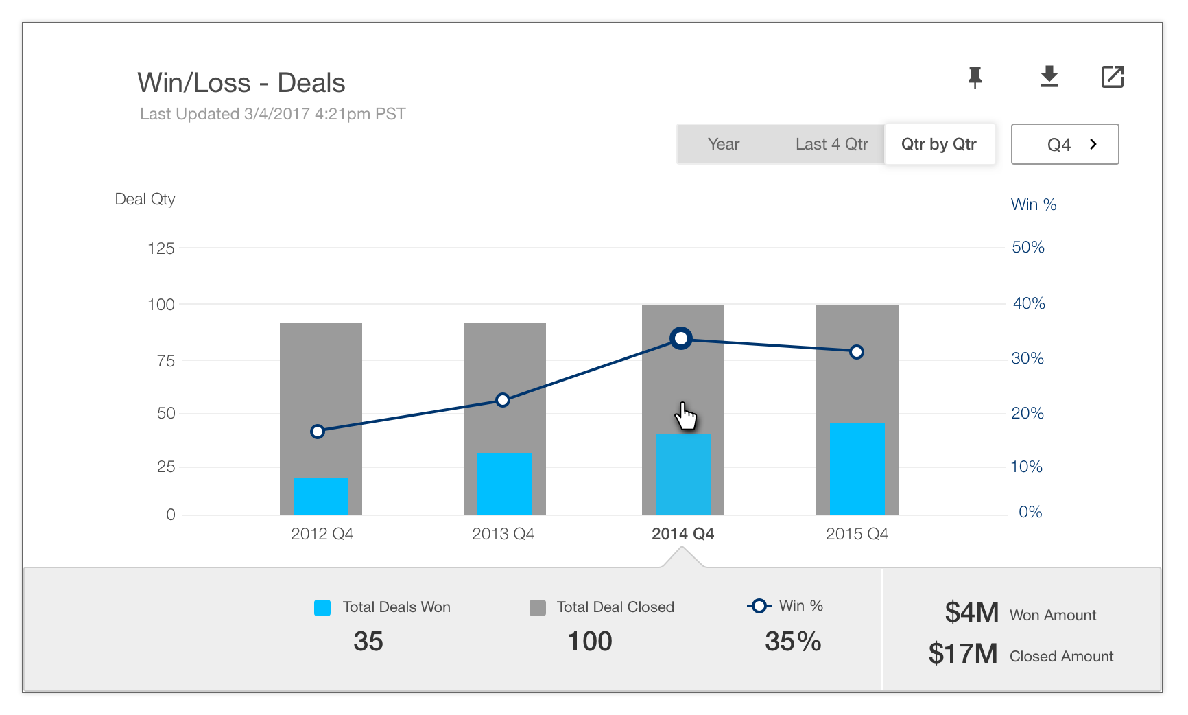
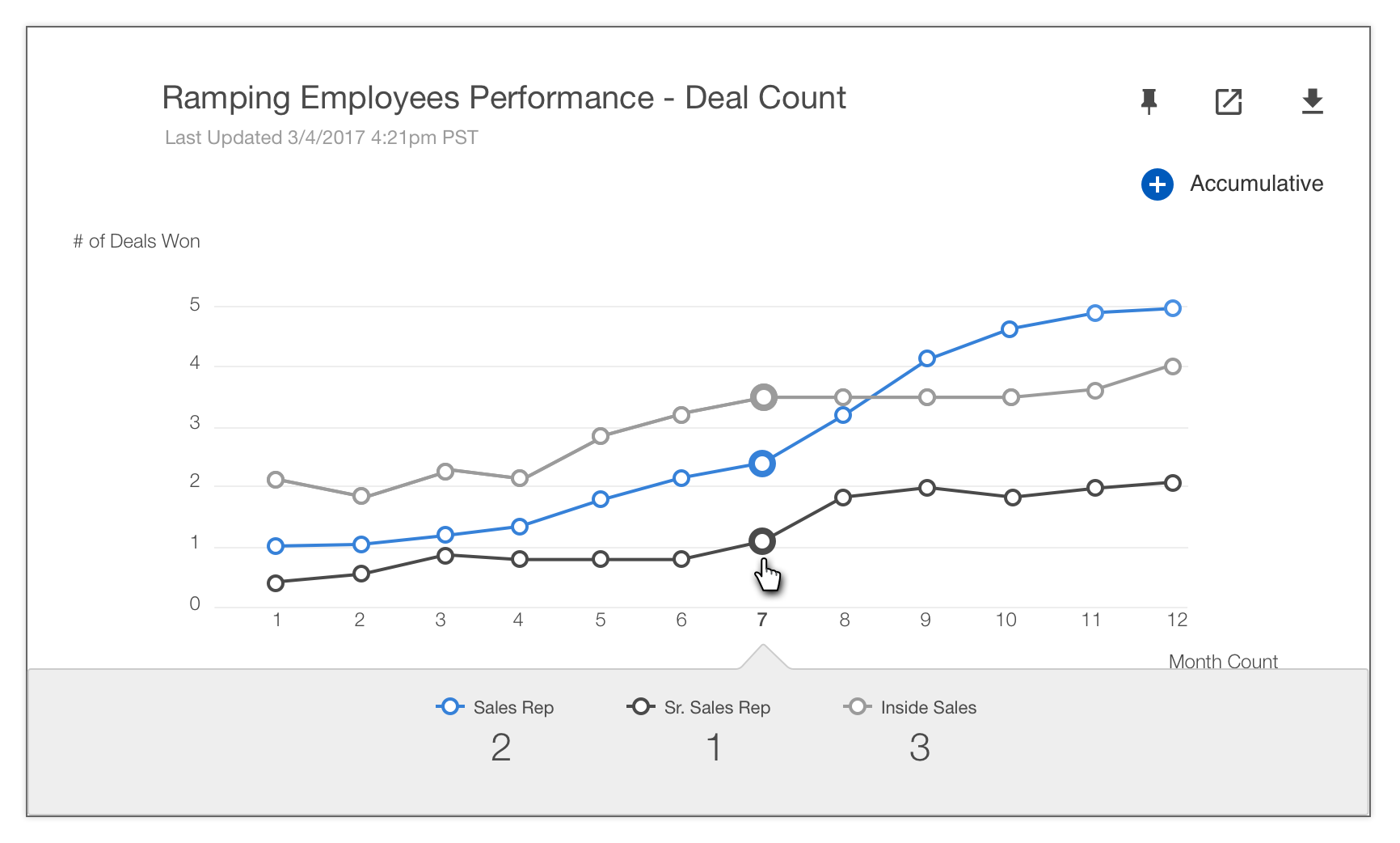
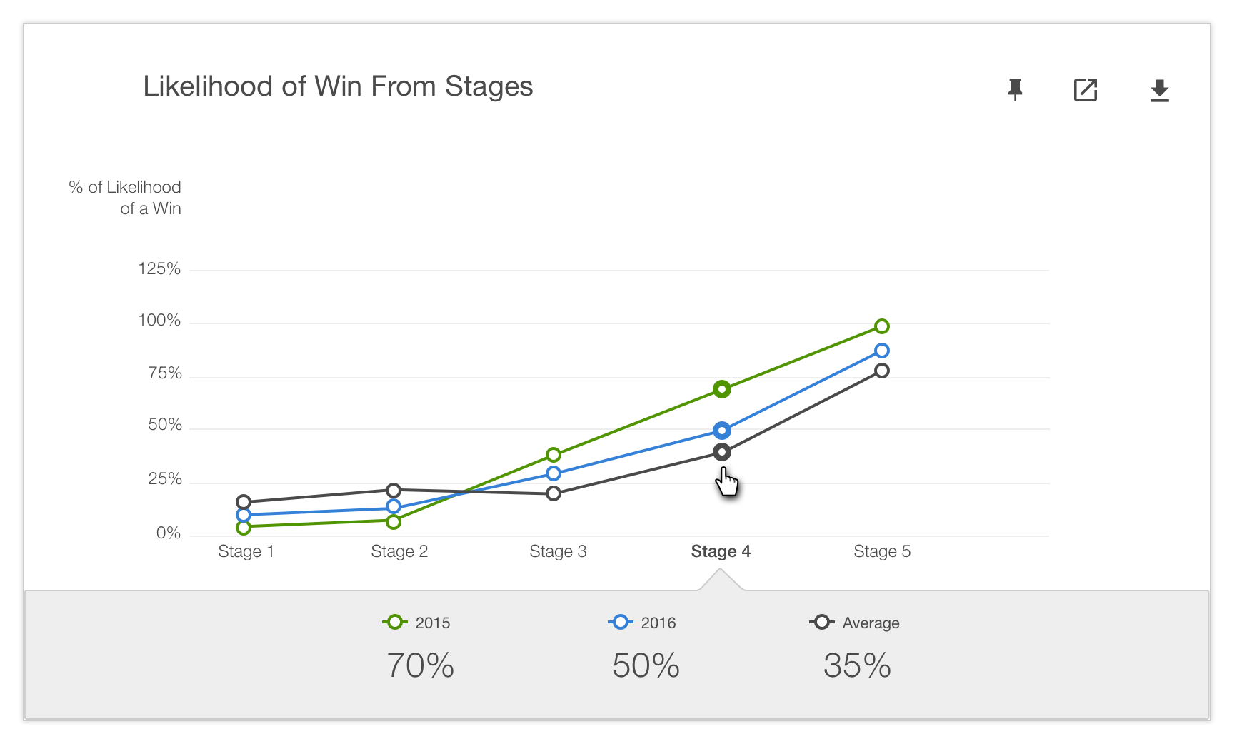
Miscalculated capacity could lead to millions in missed revenue. After getting domain knowledge from internal sales executive, I learned that sales capacity has the single biggest impact to a company's financial plan. Ensure booking goals are met is critical to any sales executives or finance management teams. I redesigned the plan overview page and came up with the summary metrics concept to highlight several key metrics data as an easy, at-a-glance view.


Target Alignment in Tree View
The application involves GEO locations of sales territories. The tree view helped to show the connection among sales teams in multiple locations, so the user can easily see capacity needs and calculate sales goal to align corporate targets across territories, products, business segments and rep types over multiple years. Each tree node represents team in geo location, user can drag and drop individual employee or a sales group from one location to another. The overall target revenue and plan revenue will be updated accordingly.

UI Framework & Style Guide
I created the overall UI framework and components as well as style guide and collaborated with engineering team to build the new UI framework that ensure UX implementation quality.


