BACKGROUND
Google Assistant is designed to be a personal digital assistant that helps user to complete tasks via conversational interactions. It offers voice commands, voice search, and voice-activated device control. Google Assistant is embedded as part of Android 10 OS released in 2019, together aiming to deliver smart, content forward OS with an adaptive & contextual intelligent layer to assist the user.
OVERVIEW
- My Role - Mobile UX designer
- Product Category - Personal digital assistant on mobile devices
- Accomplishment - Hands-on design worked closely with PM, UX, Eng from initial concept to implementation audit and final product launch.
- Length of the Project - Oct 2018 to Sept 2019
GOALS
Create Assistant’s new response experience for Android. The response design proposes a compact interface layer that dynamically adjusting height based on response content, creating a focused and stateful experience that feels more like a part of the OS, and less like another app.

PROBLEMS
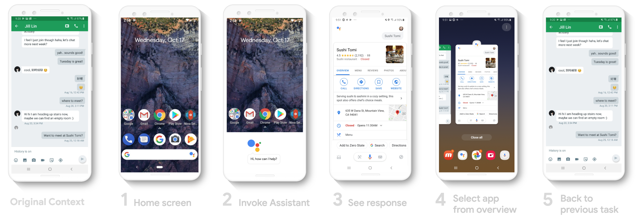
1. Extra steps + No easy way out - Most users didn’t know that they can invoke Assistant from app in the previous release. They went to home screen to invoke Assistant then select the original app from apps overview to go back to the original task. It may takes extra 5 steps to finish interacting with Assistant and back to their original task.
2. Confusing + Unpredictable
Some of the UI components from previous release were confusing. The "To" text field normally indicates as an invitation for typing according to user's mental model, but here it takes user to the contact list on their phone.
On the "Send a message" card, the "white circle under Message didn't have any indication as a message app selector when there's two apps available for users to chose.
3. Unintuitive + Inconsistent
For information that's missing but required for Assistant to complete a task, there's no intuitive way for user to provide the information that's needed.
This issue was found in previous release, tapping on the red dropdown also takes user to the contact list on their phone.
4. Lack of flexibility
For simple requests such as turn on flashlight, turn on/off Wi-fi, it should be done quickly and allow user to get back to previous task. But it required many steps to take the action, too slow and leaving un-utilized space on the screen. It was lack of flexibility to show original context.
5. Poor deep-linking
For simple requests such as open ringtone setting, change wall paper on device, it should be deep-linked to the requested setting action page for quick access to settings on the device, instead of link to a web search result.
PROCESS + SOLUTION
Identified Interaction Models


Use Case 1. Voice Activated Communications
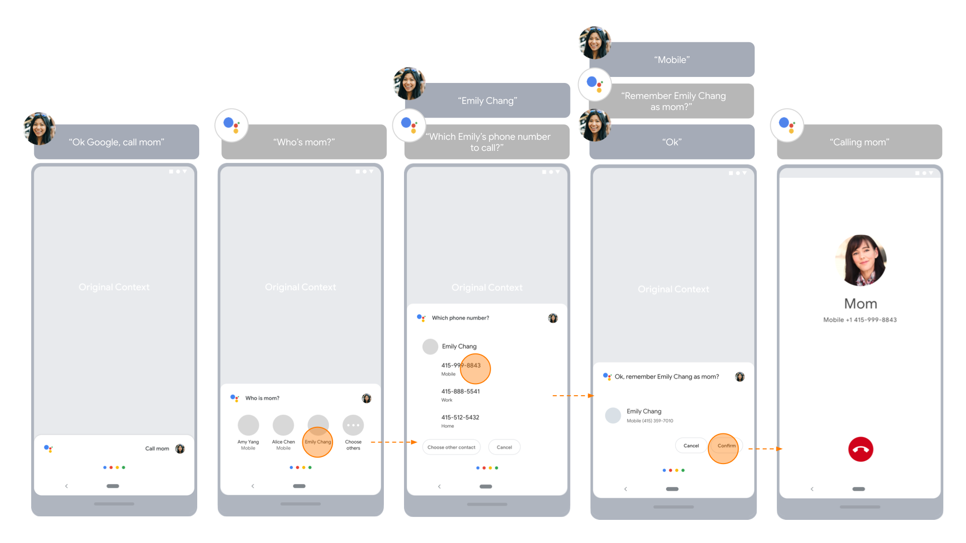
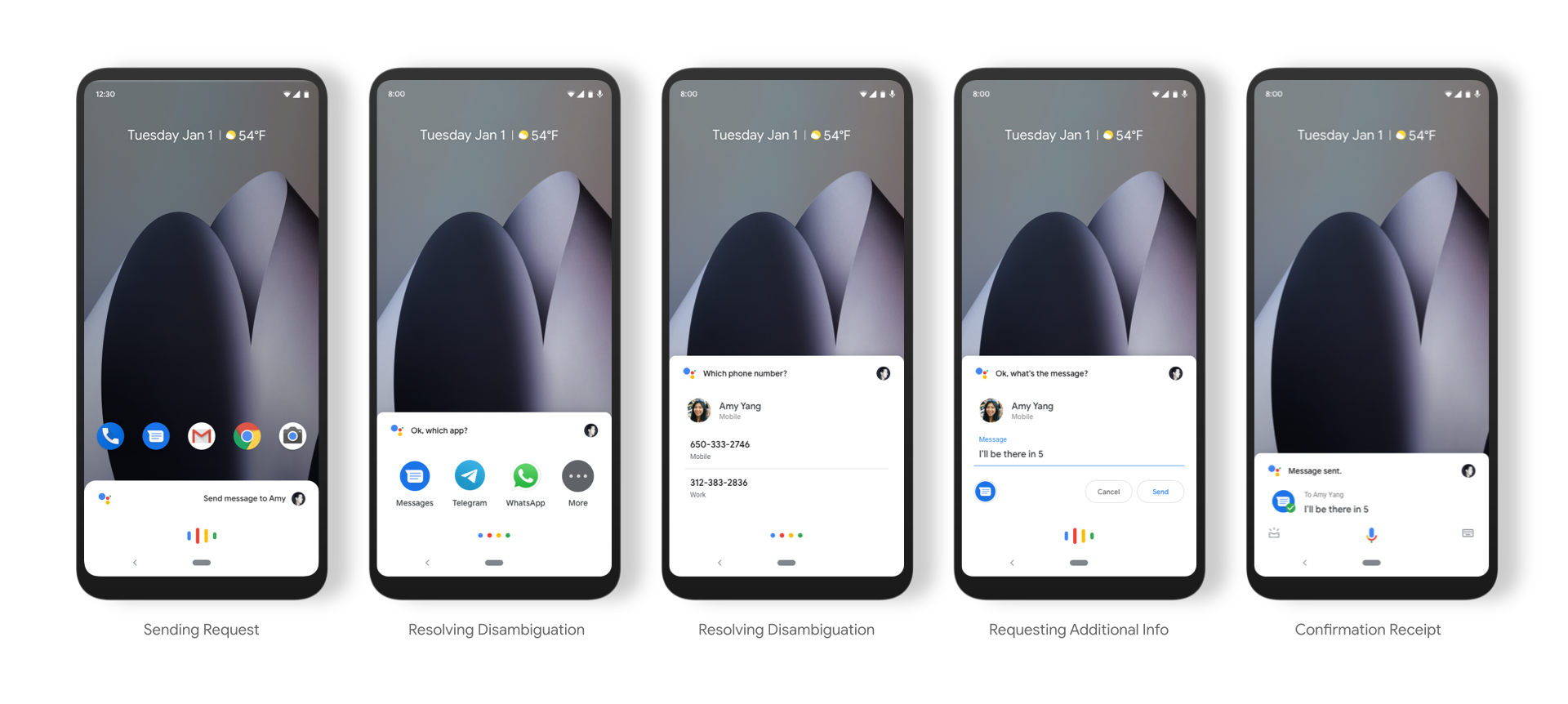
Design Pattern - Created various design patterns for Object Selector to resolve disambiguation in conversation flow
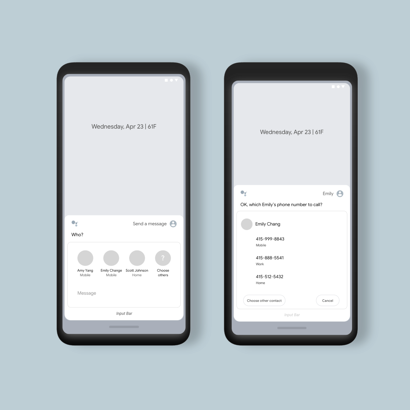
User Journeys - Created user journey that defines interaction flow on how Assistant and user communicate through resolving disambiguation
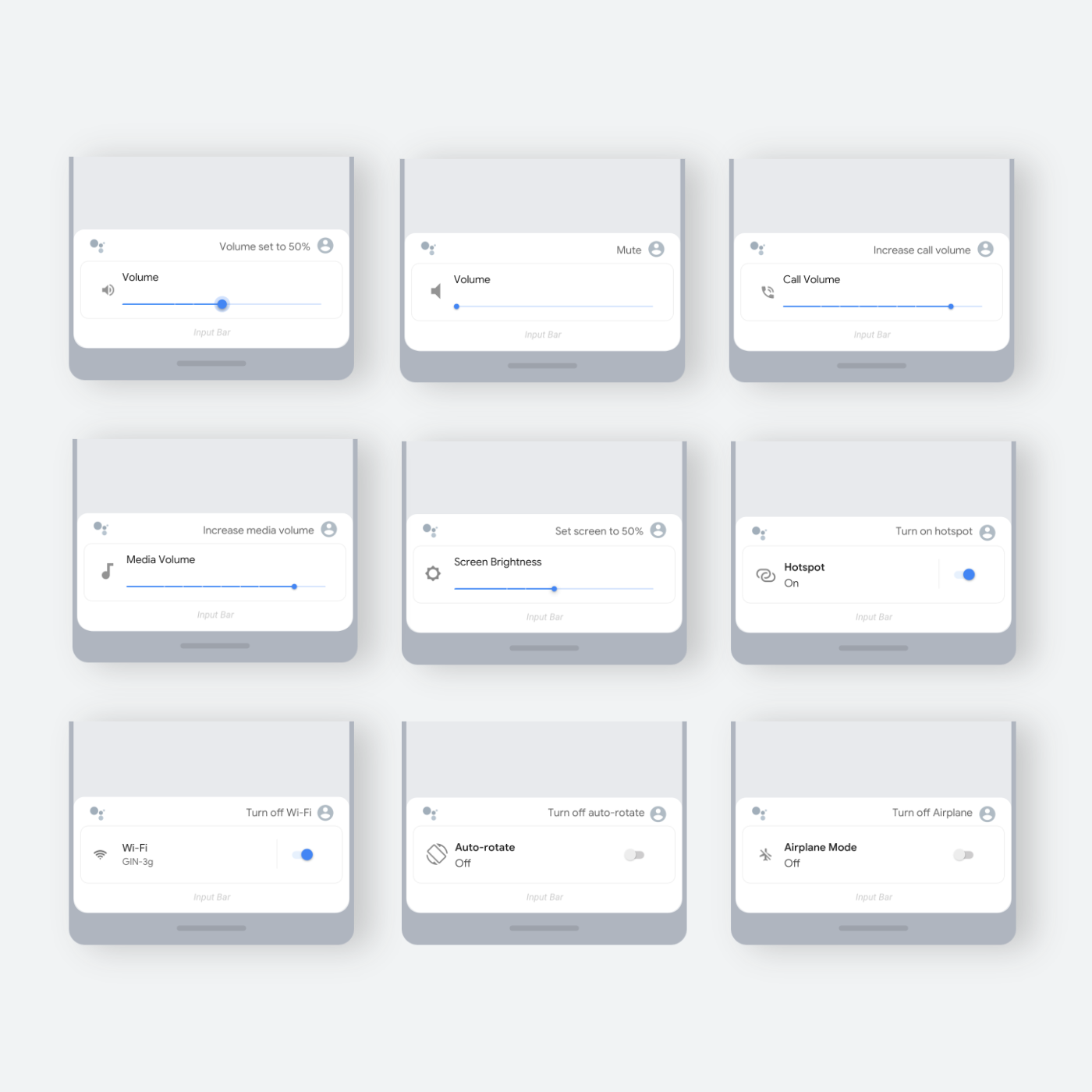
Use Case 2. Voice Activated Device Controls
Design Patterns - Created various design patterns for voice activated device control
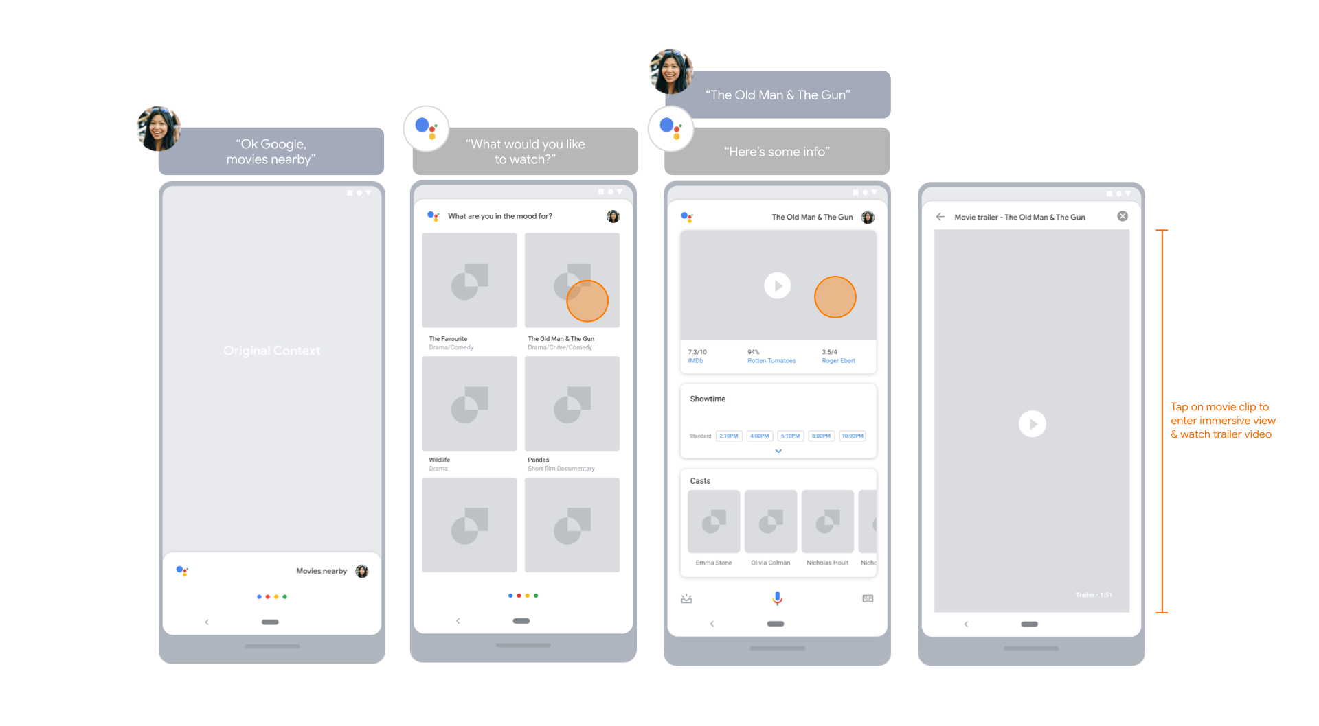
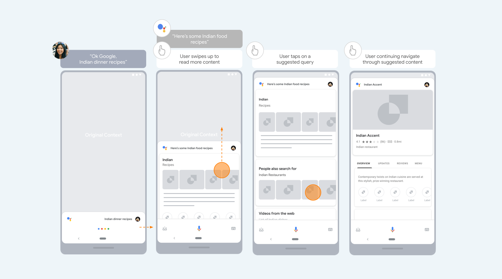
Use Case 3. Voice Activated Search (Browse & Refine)
User Journey - Created user journeys that define how user navigating through suggested queries and drilling down response details.